

When it comes to graphic design, there are many elements that contribute to the overall aesthetic and effectiveness of a design. One of the most crucial elements is typography. Typography refers to the style, arrangement, and appearance of text, and it plays a significant role in conveying a message, setting a tone, and creating a visual impact.
In recent years, typography trends have evolved and changed, reflecting the ever-changing design landscape. Designers are constantly exploring new font choices and experimenting with different typographic styles to create unique and eye-catching designs. In this blog post, we will dive into some of the latest typography trends in graphic design and explore the font choices that are currently popular.
One of the typography trends that has gained popularity in recent years is the use of bold and expressive fonts. Designers are moving away from traditional, conservative typefaces and opting for fonts that are more daring and attention-grabbing. These bold fonts can help to create a strong visual impact and draw the viewer’s attention to the message or headline.
Another trend in typography is the use of hand-drawn or custom-made fonts. These fonts add a personal and unique touch to a design and can help to create a sense of authenticity and individuality. Designers are embracing the imperfections and quirks of hand-drawn fonts, as they add character and charm to a design.
Typography is not just about the choice of font; it also involves the arrangement and layout of text. Designers are experimenting with unconventional layouts, such as overlapping or intersecting text, to create visual interest and add depth to a design. These creative layouts can help to break the monotony of traditional designs and make a design stand out.
Additionally, the use of color in typography is another trend that has gained traction in recent years. Designers are using vibrant and contrasting colors to make text pop and create a dynamic and energetic design. Color can help to evoke emotions and set the tone of a design, and when used effectively, it can enhance the overall visual impact.
Typography is an essential aspect of graphic design, and it should not be overlooked. By paying attention to the choice of font, arrangement of text, and use of color, designers can create visually appealing and effective designs that capture the attention of the viewer. Whether it’s a bold and expressive font or a hand-drawn custom font, typography has the power to elevate a design and enhance its overall impact.
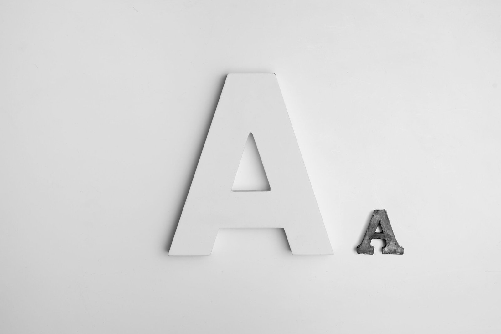
One of the prominent typography trends in graphic design is the use of bold and oversized fonts. Designers are opting for fonts that make a bold statement and grab the viewer’s attention. These fonts are often used for headlines or important text elements to create visual impact and emphasize key messages.
By using bold and oversized fonts, designers can add a sense of drama and excitement to their designs. These fonts are often paired with more subtle and minimalistic design elements to create a striking contrast and make the text stand out.
When it comes to choosing the right bold and oversized font, designers have a wide range of options to choose from. Some popular choices include sans-serif fonts like Helvetica or Futura, which are known for their clean and modern look. These fonts are often used in minimalist designs to create a sense of simplicity and elegance.
On the other hand, designers can also opt for more decorative and ornate fonts like script or display fonts. These fonts are often used in designs that require a touch of sophistication and elegance. They can be paired with bold colors or textured backgrounds to create a visually stunning effect.
Another trend in bold and oversized fonts is the use of custom or hand-lettered fonts. These fonts are unique and can be customized to fit the specific needs of a design. Designers can create their own custom fonts or work with a typographer to create a one-of-a-kind font that perfectly complements their design.
Overall, the use of bold and oversized fonts in graphic design is a powerful way to make a statement and grab the viewer’s attention. Whether it’s a headline, a call-to-action, or an important piece of information, using a bold font can help ensure that it’s noticed and remembered. As the saying goes, “Go big or go home!”
Handwritten and script fonts have become increasingly popular in the world of design due to their ability to add a personal and human touch to any project. These fonts are often chosen for their unique and distinctive qualities, allowing brands and designers to create a memorable identity that stands out from the crowd.
One of the main advantages of using handwritten and script fonts is the sense of warmth and authenticity they bring to a design. Unlike traditional fonts, which can sometimes feel cold and impersonal, handwritten and script fonts have a natural and organic feel that resonates with viewers on a deeper level. This can help establish a sense of trust and connection between a brand and its audience.
In addition to their warmth and authenticity, handwritten and script fonts also have the power to evoke a wide range of emotions. Depending on the specific style and design of the font, it can convey a sense of playfulness, whimsy, elegance, or even nostalgia. This versatility allows designers to carefully select a font that aligns with the desired tone and message of their project.
Furthermore, handwritten and script fonts are often used in branding and logo design to create a unique and memorable identity. By incorporating these fonts into a logo, a brand can instantly differentiate itself from competitors and make a lasting impression on consumers. The personal and human touch of a handwritten or script font can help convey the brand’s values, personality, and story in a way that resonates with its target audience.
When using handwritten and script fonts, it’s important to strike a balance between legibility and style. While these fonts can add a creative and artistic flair to a design, they should still be easy to read and understand. Designers must carefully consider factors such as font size, spacing, and contrast to ensure that the text remains legible and accessible to all viewers.
In conclusion, the use of handwritten and script fonts has become a popular typography trend in recent years. These fonts offer a personal and human touch to designs, adding warmth, creativity, and authenticity. Whether used in branding, logo design, or other projects, handwritten and script fonts have the power to create a unique and memorable identity that resonates with audiences and helps brands stand out in a crowded market.
One popular type of retro font is the typewriter font. These fonts are designed to resemble the typewritten text, with irregular spacing and imperfect alignment. They evoke a sense of nostalgia for a time when typewriters were the primary tool for writing and communication.
Another type of vintage font is the art deco font. These fonts are inspired by the art deco movement of the 1920s and 1930s, characterized by geometric shapes, bold lines, and a sense of glamour and luxury. Art deco fonts are often used in designs that aim to capture the elegance and sophistication of the Roaring Twenties.
Old English fonts are also popular choices for vintage-inspired designs. These fonts are reminiscent of medieval calligraphy and are often used to create a sense of tradition and heritage. They are commonly seen in logos and branding for businesses that want to convey a sense of history and craftsmanship.
Additionally, vintage script fonts are widely used in retro designs. These fonts mimic the flowing, cursive handwriting of the past and are often associated with elegance and femininity. They are commonly used in wedding invitations, greeting cards, and other designs that call for a touch of nostalgia and romance.
When using retro and vintage fonts, it’s important to consider the overall design and context. These fonts can be powerful tools for creating a specific mood or aesthetic, but they should be used sparingly and with intention. It’s also essential to ensure that the font is legible and readable, even with its unique and sometimes unconventional characteristics.
In conclusion, retro and vintage fonts offer designers a wide range of options for creating designs that evoke a sense of nostalgia and charm. Whether it’s a typewriter font for a retro-themed poster or an art deco font for a 1920s-inspired logo, these fonts can add character and personality to any design.
One of the key features of geometric and minimalist fonts is their versatility. They can be used in a variety of design contexts, from logos and branding to website headers and body text. Their clean and simple lines make them easy to read and understand, making them suitable for both digital and print designs.
Geometric fonts are often inspired by geometric shapes such as circles, squares, and triangles. They have a structured and symmetrical appearance, which can add a sense of order and balance to a design. These fonts are often used in architecture and interior design, where clean lines and simplicity are highly valued.
Minimalist fonts, on the other hand, are characterized by their simplicity and lack of ornamentation. They often have a thin and delicate appearance, which can create a sense of elegance and refinement. These fonts are popular in fashion and beauty industries, where a minimalist and sophisticated aesthetic is often desired.
When using geometric and minimalist fonts, it is important to consider their legibility and readability. While these fonts can add a unique and modern touch to a design, they can also be challenging to read if not used correctly. It is important to choose a font size and weight that is appropriate for the context and ensure that there is enough contrast between the font and the background to ensure readability.
In conclusion, geometric and minimalist fonts have become popular in graphic design due to their clean lines, simplicity, and versatility. They can add a sense of elegance and sophistication to a design and are often paired with clean and minimalistic design elements. However, it is important to consider their legibility and readability when using these fonts to ensure that the message is effectively communicated to the audience.
Custom and experimental fonts have become increasingly popular in recent years, as designers strive to differentiate their work and create visually stunning designs. With the advancement of technology and software, designers now have the tools and resources to create their own fonts or modify existing ones.
The process of creating a custom font involves meticulous attention to detail and a deep understanding of typography. Designers carefully craft each letterform, ensuring that it is visually appealing and cohesive with the overall design. They consider factors such as letter spacing, line height, and readability to ensure that the font is not only visually striking but also functional.
Experimental fonts, on the other hand, push the boundaries of traditional typography. Designers explore unconventional shapes, textures, and compositions to create fonts that challenge the norms and expectations of design. These fonts often evoke a sense of curiosity and intrigue, capturing the viewer’s attention and leaving a lasting impression.
When used strategically, custom and experimental fonts can elevate a design and make it truly memorable. They can be used to reinforce a brand’s identity, establish a unique visual language, or evoke a specific emotion. For example, a tech company may opt for a futuristic and sleek custom font to convey innovation and cutting-edge technology, while a vintage-inspired brand may choose an experimental font that emulates the aesthetics of a bygone era.
However, it is important to note that while custom and experimental fonts offer endless creative possibilities, they should be used judiciously. The legibility and readability of a font should never be compromised for the sake of aesthetics. Designers must strike a balance between visual impact and functionality, ensuring that the font enhances the overall design without hindering its purpose.
In conclusion, custom and experimental fonts have revolutionized the world of graphic design, allowing designers to create truly unique and captivating designs. Whether it’s a custom font created from scratch or an experimental font that challenges the norms of typography, these fonts offer endless creative possibilities and the opportunity to make a lasting impression.