

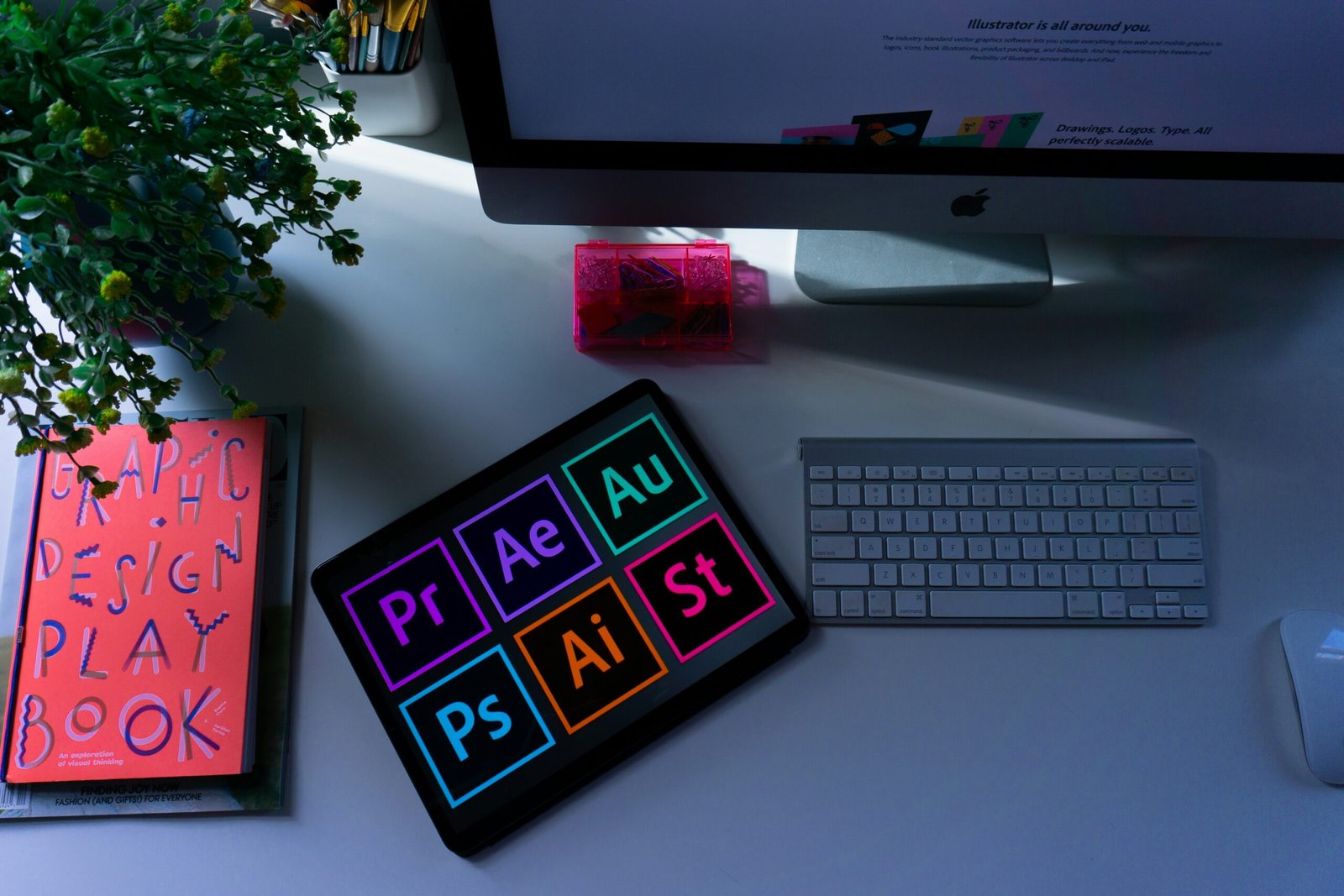
Welcome to the exciting world of graphic design! Whether you’re a seasoned designer or just starting out, understanding the principles of graphic design is essential for creating visually appealing and effective designs. In this blog post, we’ll explore four key principles of graphic design: balance, contrast, alignment, and repetition. So, let’s dive in and uncover the secrets behind these principles!
Balance
Balance is a fundamental principle in graphic design that refers to the distribution of visual weight within a composition. It involves creating a sense of equilibrium by arranging elements in a way that feels stable and harmonious. There are two types of balance: symmetrical and asymmetrical.
Symmetrical balance occurs when elements are mirrored or evenly distributed on either side of a central axis. This creates a sense of stability and formality. It is often used in traditional designs and can convey a sense of order and tranquility.
On the other hand, asymmetrical balance involves the distribution of visual weight in a way that is not mirrored or evenly distributed. This creates a more dynamic and visually interesting composition. It can be achieved by using contrasting colors, sizes, or shapes to create a sense of balance without perfect symmetry.
Understanding how to achieve balance in your designs is crucial for creating visually pleasing and well-structured compositions.
Contrast
Contrast is another important principle of graphic design that involves creating a visual difference between elements. It can be achieved through variations in color, size, shape, texture, or typography. Contrast helps to create visual interest, hierarchy, and emphasis within a design.
One of the most common ways to create contrast is through the use of color. By using colors that are opposite on the color wheel, such as black and white or red and green, you can create a strong contrast that grabs the viewer’s attention. Similarly, using contrasting sizes or shapes can create a sense of visual tension and make certain elements stand out.
Contrast is a powerful tool that can be used to guide the viewer’s eye, create hierarchy, and add visual impact to your designs.
Alignment
Alignment is the principle of graphic design that involves positioning elements in relation to each other. It helps to create a sense of order, unity, and organization within a design. Proper alignment ensures that elements are visually connected and form a cohesive whole.
There are different types of alignment, including left, right, center, and justified. Each type of alignment creates a different visual effect and can be used to convey different meanings or emotions. For example, left alignment is often used for body text as it is easier to read, while centered alignment can create a sense of balance and formality.
By paying attention to alignment, you can create designs that are visually pleasing, easy to navigate, and communicate your message effectively.
Repetition
Repetition is a powerful principle of graphic design that involves using the same or similar elements throughout a design. It helps to create unity, consistency, and visual rhythm. Repetition can be achieved through the use of colors, shapes, lines, textures, or typography.
By repeating elements, you create a sense of familiarity and reinforce the visual identity of your design. It helps to establish a visual hierarchy and guide the viewer’s eye through the composition. Repetition can also create a sense of rhythm and movement, adding visual interest and engagement to your designs.
Understanding how to effectively use repetition can elevate your designs and make them more visually appealing and memorable.
By understanding and applying these four key principles of graphic design – balance, contrast, alignment, and repetition – you can create visually appealing and effective designs that capture attention, communicate your message, and leave a lasting impression on your audience.
Balance is one of the fundamental principles of graphic design. It refers to the distribution of visual weight in a design. A well-balanced design feels stable and harmonious, while an imbalanced design can feel off-balance and visually unsettling.
There are two types of balance: symmetrical and asymmetrical. Symmetrical balance occurs when elements are evenly distributed on either side of a central axis. It creates a sense of order and formality. On the other hand, asymmetrical balance is achieved by distributing elements unevenly, yet still creating a sense of balance through visual weight and composition.
When using balance in your designs, consider the size, color, and placement of elements. Experiment with different arrangements until you achieve a visually pleasing balance that complements your design.
Balance is not only important in graphic design but also plays a crucial role in various aspects of our lives. Whether it’s maintaining a work-life balance, balancing our budgets, or even balancing our diets, finding equilibrium is essential for overall well-being.
In graphic design, balance is achieved by carefully arranging elements to create a sense of stability and harmony. It ensures that no single element overpowers the others, and the composition feels visually pleasing. Achieving balance requires a keen eye for detail and an understanding of how different elements interact with each other.
When considering balance in design, it is important to think about the visual weight of each element. Visual weight refers to how much attention an element attracts compared to others. Elements with more visual weight appear larger, bolder, or brighter, while those with less weight appear smaller, lighter, or more subdued.
Balance can be achieved through symmetrical or asymmetrical arrangements. Symmetrical balance creates a mirror image effect, with elements on one side of the design mirroring those on the other. This creates a sense of order and formality. Asymmetrical balance, on the other hand, involves distributing elements unevenly, yet still maintaining a sense of balance through careful placement and visual weight.
When designing with balance in mind, it is important to consider the size, color, and placement of elements. Larger elements tend to have more visual weight, so they should be balanced with smaller elements or negative space. Colors can also contribute to the visual weight of an element, with brighter or darker colors attracting more attention. Placing elements strategically can help create a sense of balance and guide the viewer’s eye through the design.
Ultimately, achieving balance in graphic design requires a thoughtful and intentional approach. It is a skill that can be developed and refined over time, and it plays a crucial role in creating visually appealing and effective designs.
Contrast is all about creating visual interest and making elements stand out. It involves using different colors, sizes, shapes, and textures to create a stark difference between elements. Contrast helps guide the viewer’s attention and adds depth and dimension to a design.
One of the most common ways to create contrast is through color. Using complementary colors (those opposite each other on the color wheel) can create a striking contrast. For example, pairing a vibrant red with a deep green can create a visually stimulating effect. Similarly, using contrasting font sizes or bold and thin lines can add visual interest to your designs. For instance, using a large, bold font for headings and a smaller, thinner font for body text can create a clear distinction between the two.
However, it’s important to note that contrast doesn’t mean using every color in the rainbow or making every element scream for attention. It’s about creating a balance between elements that stand out and those that recede into the background. This balance ensures that the design remains visually appealing and doesn’t overwhelm the viewer. By strategically applying contrast, you can create a hierarchy of elements within your design, guiding the viewer’s eye and emphasizing key information.
In addition to color and typography, contrast can also be achieved through the use of different shapes and textures. For example, incorporating a smooth, curved shape amidst a composition of angular elements can create a striking contrast. Similarly, juxtaposing a rough, textured background with a clean, minimalistic foreground can add depth and visual interest to a design.
Overall, contrast is a powerful tool in the designer’s arsenal. It allows for the creation of visually captivating designs that effectively communicate information and engage the viewer. By understanding and applying the principles of contrast, designers can elevate their work and create impactful visual experiences.
Alignment is often overlooked but plays a crucial role in creating a polished and professional design. It refers to how elements are positioned in relation to each other. Proper alignment helps establish a visual connection between elements and creates a sense of order and organization.
When aligning elements, consider both horizontal and vertical alignment. Aligning elements along a common horizontal or vertical axis creates a sense of unity and cohesion. It also makes your design easier to read and navigate.
Don’t be afraid to experiment with different alignment options. Centered alignment can create a balanced and formal look, while left or right alignment can add a dynamic and asymmetrical feel to your design.
Horizontal alignment involves positioning elements along the x-axis, which runs horizontally across the screen. This can be achieved by using margins, padding, or the CSS property “float.” By aligning elements horizontally, you can create a clear hierarchy and guide the reader’s eye through the content.
Vertical alignment, on the other hand, refers to the positioning of elements along the y-axis, which runs vertically from top to bottom. This can be achieved by using CSS properties such as “line-height” or “vertical-align.” Proper vertical alignment ensures that elements are visually balanced and harmonious.
Consider the overall layout of your design when deciding on alignment. If you have a grid-based layout, aligning elements to the grid lines can create a structured and organized look. On the other hand, breaking away from the grid and using overlapping or staggered alignment can add visual interest and create a more dynamic composition.
Remember to also consider the content and purpose of your design when choosing alignment. For example, if you have a text-heavy design, left alignment is often the most readable choice as it follows the natural reading pattern of most languages. However, if you want to draw attention to a specific element or create a sense of importance, center or right alignment can be more effective.
In conclusion, alignment is an essential aspect of design that should not be overlooked. By carefully considering both horizontal and vertical alignment options, experimenting with different approaches, and taking into account the overall layout and content of your design, you can create visually appealing and well-organized compositions that effectively convey your message.
Repetition is a powerful design principle that involves using recurring elements to create unity and consistency in a design. It helps establish a visual rhythm and reinforces the overall message or theme.
Repetition can be applied to various design elements, such as colors, shapes, patterns, or typography. By repeating these elements throughout your design, you create a sense of harmony and cohesiveness.
For example, if you are designing a website for a restaurant, you can use repetition by incorporating the same color scheme, font styles, and graphic elements across different pages. This repetition will create a consistent visual identity for the restaurant and help users navigate the website more easily.
Moreover, repetition can also be used to highlight important information or create emphasis. By repeating a specific element, such as a bold font or a vibrant color, you can draw the viewer’s attention to a particular area of your design.
However, be mindful not to overdo it. Too much repetition can make your design monotonous and boring. Find the right balance between repetition and variation to keep your design visually engaging.
Additionally, repetition can also be used strategically to create a sense of familiarity and reinforce brand recognition. By consistently using specific design elements in your marketing materials, such as a logo or a slogan, you can reinforce your brand identity and make it more memorable for your target audience.
Ultimately, repetition is a powerful tool in design that can help create a cohesive and visually appealing composition. By carefully considering the elements you choose to repeat and finding the right balance, you can enhance the overall impact and effectiveness of your design.