

CSS (Cascading Style Sheets) is a powerful tool used in web development to style and format the appearance of a webpage. With CSS, you can control the layout, colors, fonts, and other visual aspects of your website. In this fun lesson, we will explore some of the key concepts and techniques in CSS, with code highlights and examples to help you understand and apply them.
One of the fundamental concepts in CSS is the use of selectors. Selectors are used to target specific elements on a webpage and apply styles to them. There are various types of selectors, such as element selectors, class selectors, and ID selectors. Element selectors target specific HTML elements, while class selectors target elements with a specific class attribute, and ID selectors target elements with a specific ID attribute.
For example, let’s say you want to style all the paragraphs on your webpage to have a font size of 16 pixels and a color of blue. You can use the element selector “p” to target all the paragraphs and apply the desired styles. Alternatively, if you only want to style a specific paragraph, you can assign it a class attribute, such as “highlight”, and use the class selector “.highlight” to target it and apply the styles.
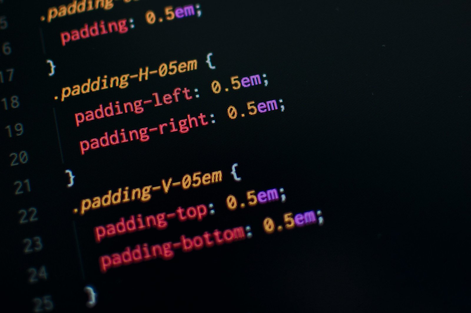
In addition to selectors, CSS also provides a wide range of properties that you can use to style your webpage. Properties control various aspects of an element’s appearance, such as its size, position, color, and background. Some commonly used properties include “font-size” for controlling the size of text, “color” for changing the color of text, “background-color” for setting the background color of an element, and “margin” for controlling the spacing around an element.
Furthermore, CSS allows you to apply styles to elements based on their relationship to other elements. This is achieved through the use of combinators and pseudo-classes. Combinators allow you to target elements based on their relationship to another element, such as the direct child, sibling, or descendant of a specific element. Pseudo-classes, on the other hand, allow you to target elements based on their state or position within the document, such as when they are being hovered over or are the first child of their parent element.
To apply styles to your webpage using CSS, you can include the CSS code directly in your HTML file using the <style> element, or you can link an external CSS file using the <link> element. The latter method is generally preferred for larger projects, as it allows for better organization and separation of concerns.
In conclusion, CSS is a powerful tool that enables you to style and format the appearance of your webpages. By understanding the key concepts and techniques in CSS, you can create visually appealing and user-friendly websites. In the following sections, we will dive deeper into the various aspects of CSS and explore advanced techniques to enhance your web development skills.
Before we dive into the exciting world of CSS, let’s start by understanding how to include CSS in an HTML document. There are three main ways to apply CSS styles to your HTML:
style attribute. This method is useful when you want to apply specific styles to individual elements. For example, if you want to make a paragraph blue and increase its font size, you can use the following code:<p style="color: blue; font-size: 18px;">This is a paragraph with inline styles.</p><style> tags in the <head> section of your HTML document. This method is useful when you want to apply styles to multiple elements on the same page. For example, if you want to make all paragraphs on your page blue and have a font size of 18 pixels, you can use the following code:<style>p {color: blue;font-size: 18px;}</style><p>This is a paragraph with internal stylesheet.</p><link> tag. This method is useful when you want to apply styles to multiple pages across your website. By creating a separate CSS file, you can easily make changes to the styles without modifying each individual HTML file. To link an external CSS file, you can use the following code:<link rel="stylesheet" href="styles.css">With these three methods, you have the flexibility to choose the most suitable approach for your project. Whether you need to apply specific styles to individual elements, styles to multiple elements on the same page, or styles to multiple pages across your website, CSS provides the tools to make your web pages visually appealing and engaging.
In CSS, selectors are used to target specific HTML elements and apply styles to them. Let’s explore some commonly used selectors:
p selector:p {color: blue;font-size: 18px;}.highlight selector:.highlight {background-color: yellow;}#logo selector:#logo {width: 200px;height: 100px;}These are just a few examples of the many selectors available in CSS. Selectors can also be combined to target elements more specifically. For instance, you can use a combination of element and class selectors to apply styles to specific paragraphs with a certain class:
p.highlight {font-weight: bold;}This selector will only target paragraphs with the class “highlight” and apply the specified style. In addition to these selectors, CSS also offers pseudo-classes and pseudo-elements that allow you to target elements based on their state or position within the document.
When applying styles to elements, it’s important to consider the specificity of the selector. The more specific a selector is, the higher its precedence in determining the final styles. This means that a selector with an ID will override a selector with a class, and a selector with a class will override a selector with just an element name.
Understanding and effectively using selectors is crucial for creating well-styled and organized web pages. By targeting specific elements and applying appropriate styles, you can create visually appealing and user-friendly designs.
CSS Flexbox is a layout module that provides a more efficient way to arrange and align elements within a container. It offers a flexible and responsive approach to building complex layouts without relying on floats or positioning.
Let’s explore some key concepts of CSS Flexbox:
display: flex; property to an element.row (default), row-reverse, column, or column-reverse.flex-start, flex-end, center, space-between, and space-around.flex-start, flex-end, center, baseline, and stretch.Here’s an example of a flex container with three flex items:
#container {display: flex;flex-direction: row;justify-content: space-between;align-items: center;}By experimenting with different flexbox properties, you can create dynamic and responsive layouts that adapt to different screen sizes and devices.
Flexbox also provides additional properties and features to further enhance the layout capabilities. For example, the flex-wrap property allows flex items to wrap onto multiple lines if there is not enough space in the container. This can be useful for creating responsive designs where the number of items per row adjusts based on the available space.
Another powerful feature of Flexbox is the ability to control the size of flex items using the flex-grow, flex-shrink, and flex-basis properties. These properties allow you to specify how flex items should grow or shrink to fill the available space within the container.
In addition to the main axis and cross axis, Flexbox also introduces the concept of the “flex line” or “flex line box”. This is a line that contains flex items and is created when flex items wrap onto multiple lines. You can control the alignment of flex lines using the align-content property.
Overall, CSS Flexbox is a powerful tool for creating flexible and responsive layouts. It simplifies the process of arranging and aligning elements within a container, making it easier to build complex designs without relying on complicated CSS hacks or frameworks.